BETA version 2.5

NINETYTWO is an artistic-design studio which specialized in creating brand identities, book and type design as well as conceptual photography and art-direction. Owned by Gal Shneor and Enav Sharon-Nitzan.

R  e  A  D    M  O  R  E
Thank you
Thank you

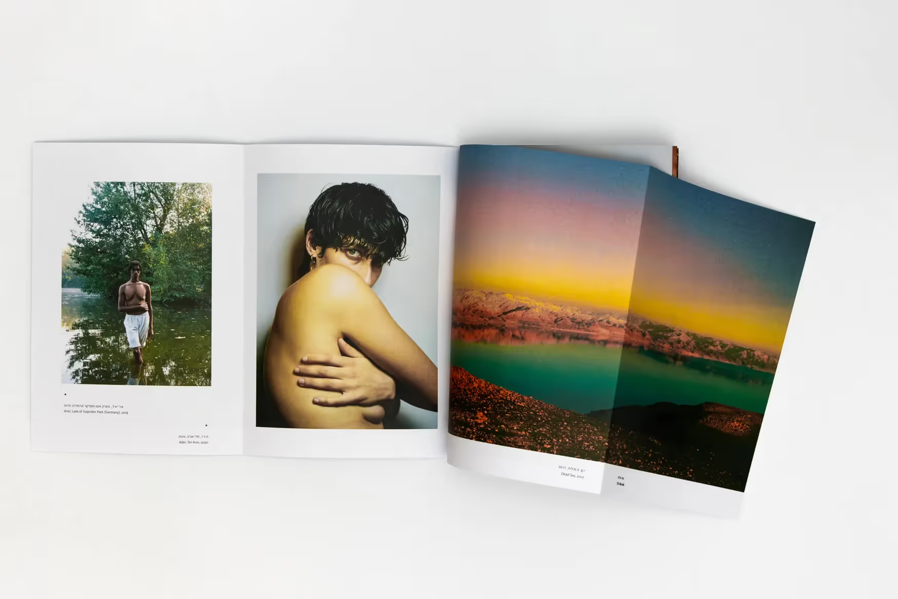
<h-300-italic>The Photobook<h-300-italic> is an exhibition curated by Danielle Gorodenzik, presented at the <italic>Indie Photography Group Gallery<italic>, March 2021. While designing both exhibition’s catalogue and entire visual identity relied on the concept of photo-film as a main element both the grid and the custom-made bi-lingual logotype based on.

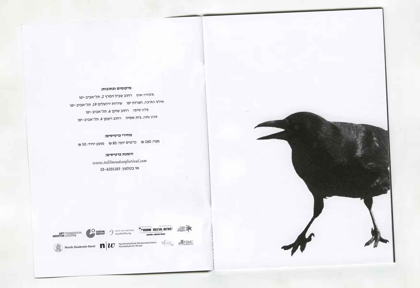
<h-300>‘Darker Than Black’<h-300> is the 2023’s edition of <italic>Tzlil Meudcan<italic> (Hebrew for “updated tone”)—International Festival [and a research platform] for Contemporary Chamber Music. The black-crows-based visual identity inspired by the political chaos which happening in Israel (during the time which this year’s edition taking place), due to the judicial overhaul protests following the government’s attempts to legislate.

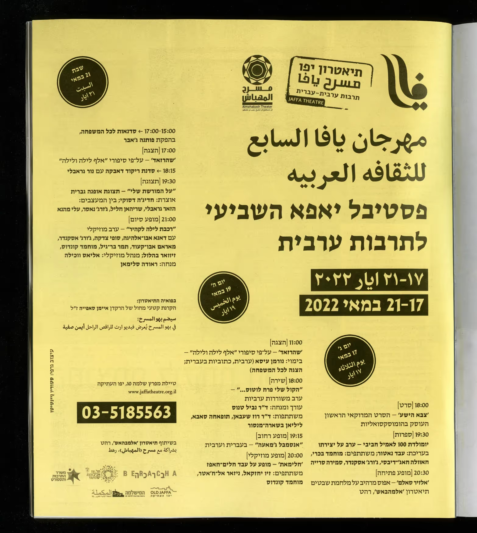
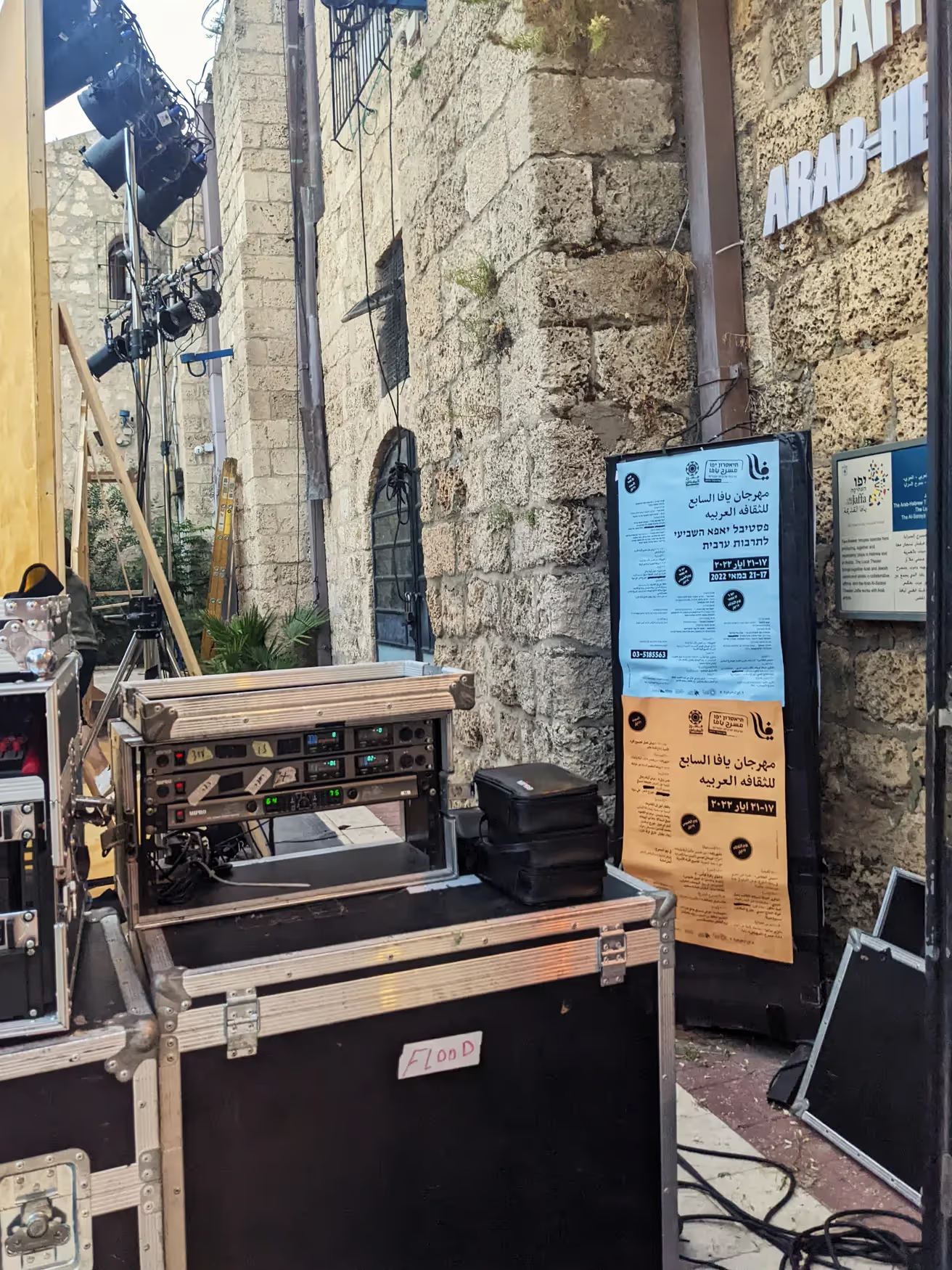
<h-300-italic>Yaffa Festival<h-300-italic> <italic>for Arabic Culture<italic> which taking place for the seventh time at the Arab-Hebrew Theatre, Jaffa. The 2022 edition’s identity built on typography-based grid and “grungy” colourful concept.

<h-300>80’s Cocktail Party<h-300> is a conceptual photographed celebration, an assemblage, for the second-ever collection of the house of prints ‘Better in Person’ by the Israeli textile designer Michal Luria. The whole idea turns around the longing to get back to this era and weirdness which comes with it.

<h-300-italic>Rashid Johnson: Broken Crowd<h-300-italic> is an exhibition presented at the Israel Museum, Jerusalem (curated by Orly Rabi) from Summer 2023 to Spring 2024. The graphic design refers to the exhibition theme <italic>but<italic> with a minimalistic approach to the typography.

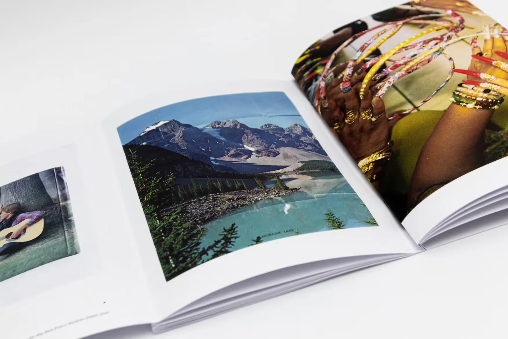
<h-300>‘Following Myself’<h-300> is Robert (Rami) Yerushalmi’s 2021 artist-book composed from poets, short stories and thoughts interlaced together with analogue photographs taken throughout nearly three decades of creation. This is a book design project that started a depth process of curating, concept developing and typographic settings which transformed into a collaboration practice.

<h-300-italic>Saturday Night<h-300-italic> deals with the cycles of nature, family and planets through both mind and emotion prisms. Capturing a long and dated personal imagery that didactically illustrates the journey between the past and nowadays, alongside texts on the range of philosophy to astrology and science.

<h-300-italic>Enlightenment<h-300-italic> is a photographic project which response and interpreted a Zhàozhõu’s <italic>Chán<italic> (Chinese <italic>Zen<italic>) text by using a multiple exposures technique with an analogue camera. This technique allows the sequence to become a uniform and inseparable one by a mixed visual outcome.

<h-300>David Jerusalem<h-300> is a Hebrew-classical typeface designed by Ismar David which began to work on in 1934-Jerusalem and continued during <italic>World War II<italic> and until 1954, when it was ultimately published by <italic>Intertype<italic> (New-York City). <italic>David<italic> has a calligraphic character, but at the same time the letter is <italic>not<italic> traditional—it is characterized by minimalist cleanliness and precise formal reduction. This digitalization follows the original design of the three basic styles, and constantly in progress to expand and complete the entire family.

<h-300-italic>Brise dé Mer<h-300-italic> by Noy Lamberg, offers women surfing fashion including surfing swimsuits, shirts, leggings and so on, made for a <italic>real<italic> women’s body. From scratch, all the visual identity’s components tailored to a brand strategy and photographed first capsules collection, as well as the creative direction and styling.

<h-300>‘War is Beautiful’<h-300> is a classic-masses anthology that examines the phenomenon of <italic>kitsch<italic> by collecting together philosophical texts by Thomas Kulka to Walter Benjamin etc. The book design practice approaching the contemporary art scene with an exceptional format what creates an unusual reading experience and transferring the book into an independent object.

<h-300>‘Concert’<h-300> is a metal-lettering typeface revival <italic>exclusively<italic> made for a nostalgic rebranding of the Tel-Avivian <italic>Heichal Ha'Tarbut<italic>. The fully <italic>bi-lingual<italic> brand face based on the original metal lettering which appears on the Fredric Mann Auditorium—today named after Charles Bronfman, Tel-Aviv, Israel. Just as the building and its architecture influenced by both <italic>Bauhaus<italic> and <italic>De Stijl<italic> movements, so the style of the letters is functional and devoid of decoration.

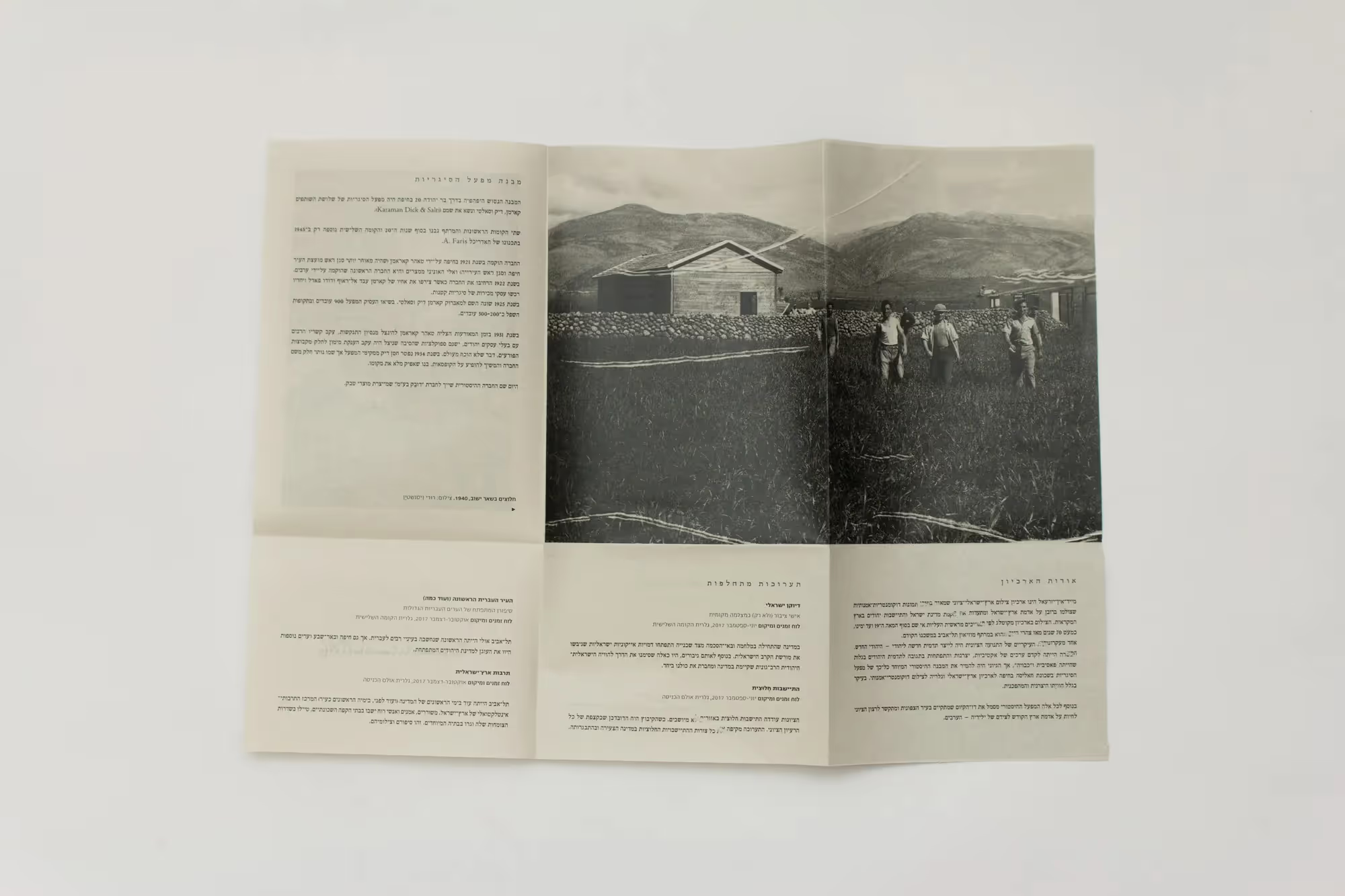
<h-300>“Made-in-Israel”<h-300> is a proposed cultural branding for a Zionist-Israeli photography archive which also functions as a rotating exhibitions gallery of its own visual materials. The proposal includes a dynamic logotype, complete visual language, semi-annual photo catalogue and so on.

<h-300>‘He was Awarded the<h-300><h-300-italic> Medal of Courage’<h-300-italic> is a 13-depth-interviews-based reference book created for the 45th anniversary of the Yom Kippur war, October 1973. This isn’t classic memorial-reference book but one that combines couple of book genres into the same hard-copy.

<h-300>Sapir Tel-Aviv<h-300> is a modern but cheeky typeface based on basic geometric shapes. This digitalization created in an archival act which combines couple of raw materials with reliance on references (such as advertising flyers) into a full working typeface.

<h-300-italic>On the Edge<h-300-italic> is a political play by Motti Lerner dealing with topics of “Solid Rock” operation in Gaza (2014) in light of literature, from the prism of a family drama that focuses on a father-only-son relationship after the passing-away of the mother. This project is an entire graphic package including an eight-mass play programme, running at Jaffa Theatre—the Hebrew-Arab Theatre.

<h-300>WAR IS OVER?<h-300>is a contemporary new edition of ‘Peace with Honour’ by A. A. Milne. An artistic book re-publication which made in collaboration with an Israeli based photography artist, Dorit Shabbat.

<h-300>‘The Eleventh Feeling’<h-300> is a story written by Enav Sharon-Nitzan in order to help children to deal with their feelings. To accept and learn about them. The mixed-media illustrations made with pencil, watercolours and digital collaging by Enav.

<new>NEW<new><h-300>“Ground Labor”<h-300> is a graphic package made for the art exhibition ‘eARTh’, July–October 2024 at the contemporary art space of <italic>Trumpeldor Gallery<italic> located in the heart of the Be'er-Sheva old city. In days when the ground-we-stand-on is burning, the expression ‘place’ (or location) is burdening than ever before. The exhibition focuses on the <italic>earth<italic> theme, and to the observation into the earth as an idea and an element; a study of the relations between the individual with <italic>the<italic> earth.

<h-300>“Lee-Ann’s Book”<h-300>is an illustrated project made for Enav’s first-born niece, November 2014. This was a long-worth-waiting book which Enav and her oldest sister (The other aunt of Lee-Ann) wrote, and Enav created the Gouache-on-paper-illustrations.

<h-300>Mathematics<h-300> is an experimental typography project referring to a critical standpoint on the material consumerism and compared to the consumption of culture, as the deprivation of our generation. Due course to it, the understanding which the written work is the very core of the culture consumption led to a mathematical presence processing of each Hebrew letter in a substantive text by Kasimir Malevich (to the written word) about the existence of colour and stain in a space and its importance to the human thought.

<h-300-italic>Khõra<h-300-italic> is a visual identity <italic>proposal<italic> for graduate exhibition at the <italic>Neri Bloomfield<italic> School of Design and Education, class of 2018. The branding development based on the acknowledgment which the visuals will live or take place in the urban spaces, will cover the walls of the academy’s building and in the digital universe. The entire creative behind this proposal developed from the Jacques Derrida’s <italic>post-modern<italic> mass and idea of “birth”.

<h-300-italic>‘INNARDS’<h-300-italic> is a human assemblage based on a photographed styling, art-direction, conceptual-artistic visualization followed a graduation project by Michal Luria, a textile designer who lives in Tel-Aviv.

<h-300>Frank-Rühl Leipzig<h-300> is a 1910’s typeface originally designed by Rephael Frank, a Jewish cantor from Leipzig (Germany), and Otto Rühl, a German print-man. This digitalization is the studio’s version for the most classic and <italic>yet<italic> most common, known and popular typeface of all times.

<h-300-italic>‘Water is the Arkhe’<h-300-italic> is a book design project which based on Thales of Miletus’s notable idea that all things are from water meaning <italic>it<italic> [the water] is the matter of everything. The book consecutive after the subjective experience of a swimmer inside the swimming pool water by combining philosophical Cannons alongside a dis-orientation and associative imagery.

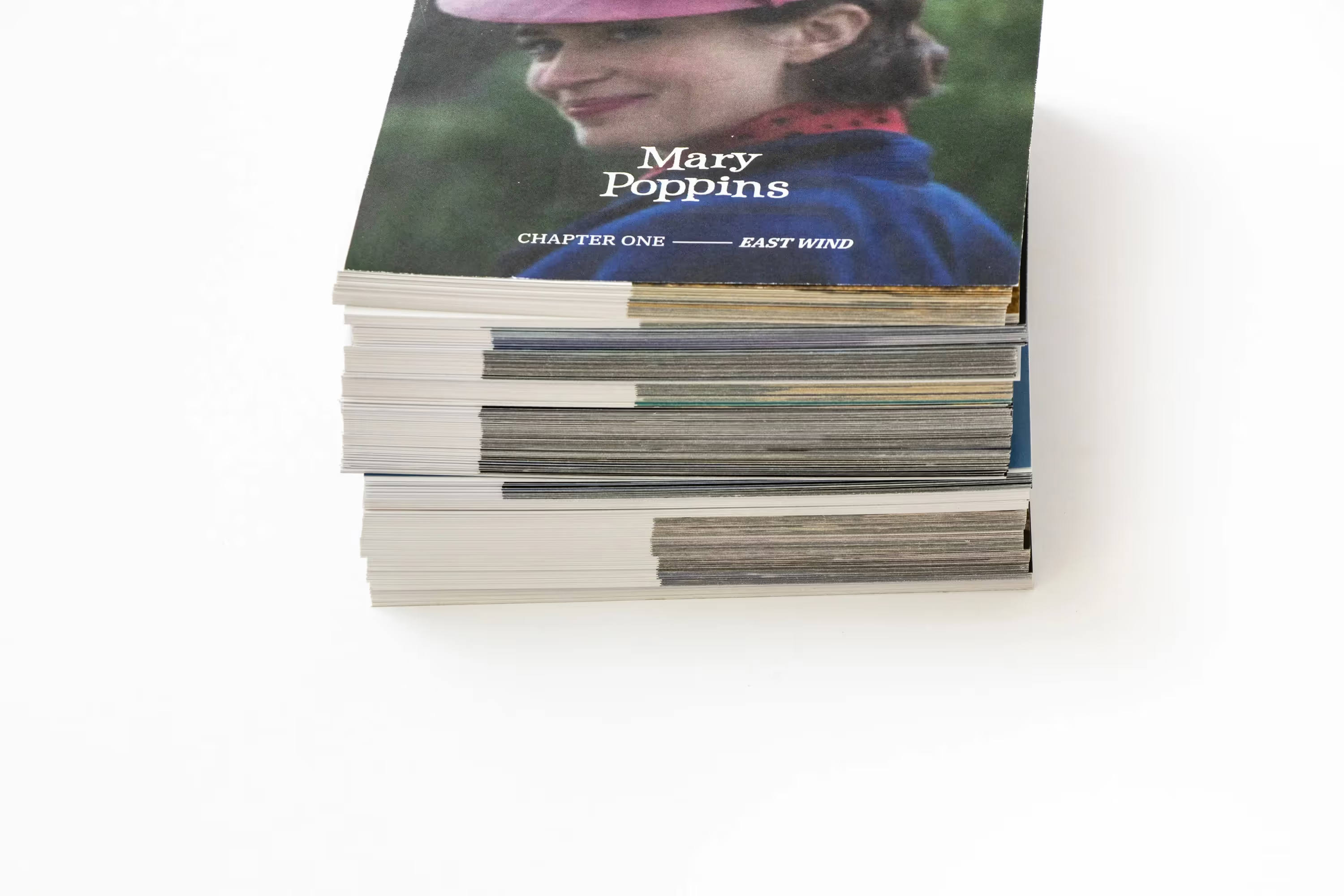
<h-300-italic>East Wind<h-300-italic> is the first chapter of a prototype which developed as an experimental-hybrid book design project. This is a digital-first project that driven by the idea of interactive design on physical paper.

<h-300>Rectangular Haim Warsaw<h-300> is a narrow version of the squared Hebrew classic of ‘Haim’ (ca. 1930), originally designed by Jan LeWitt, around mid-nineteen-thirties in Poland. This <italic>very<italic> digitalization made specially for a re-branding project, but continue to function as a leading face in the studio’s diverse nowadays commissions.

<new>NEW<new><h-300-italic>‘An Entire World’<h-300-italic>is the 2024’s edition of <italic>Tzlil Meudcan<italic>, the International Festival for Contemporary Chamber Music. While the continuing war shadows, the festival <italic>held<italic> this year under the theme of ‘anyone who sustains one soul, ascribes as if he <italic>sustained an entire world<italic>’ but in a <italic>slimmer format<italic> than usual. The longing for peaceful days guided the conceptual development within the yearly theme; and <italic>therefore<italic> the leading poster made as an homage to the <italic>David Tartakover<italic>’s legendary national Israeli independent poster, designed for the 30th anniversary—contains the word “peace” which <italic>emblazoned<italic> on a blue skies setting.

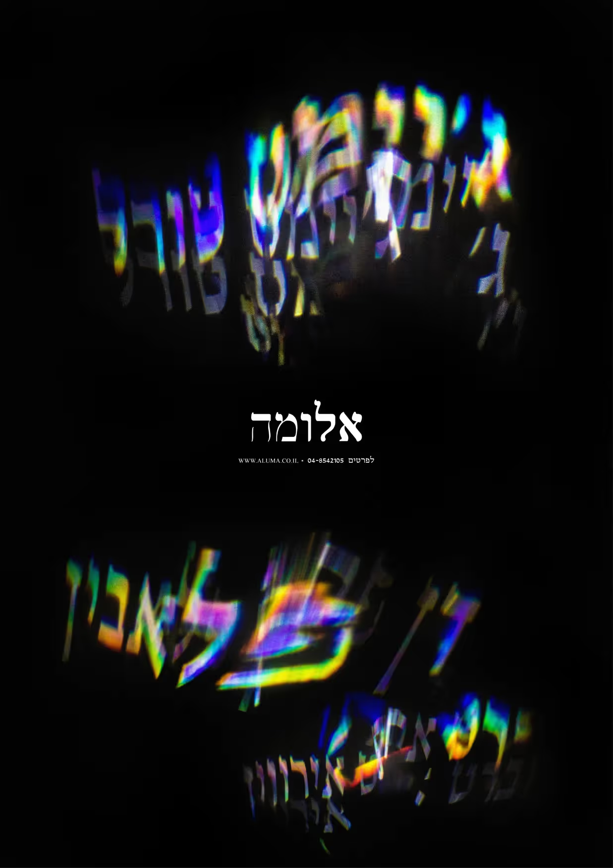
<h-300>“Aluma”<h-300>(the Hebrew word for light beam) is a visual identity project for light and space art movement exhibition taking place in several <italic>abandoned<italic> buildings and spaces in Downtown Haifa. The idea that guided the design was the doctrine of <italic>present-absentees<italic> (“Nokhehim Nifkadim” in Hebrew) which known from the Israel independence war, 1947–49, once the Arabs who owned those buildings deserted or deported their homes and belongings, and left the Israeli territory.

<h-300>Like a Thread of Scarlet<h-300> is a Master’s thesis about the most known and appreciated book designer in Israel, <italic>Michael Gordon<italic>. With hundreds of books he designed over more than three decades of creation, his formulas and ideas’ <italic>impact<italic> is felt in the work of the Israeli new generation of book designers. <italic>‘The Concept of the Book and its Page as an Actual (Real) and Metaphysical Space in Michael Gordon’s Works’<italic> dissertation was written by <italic>Gal Shneor<italic> and made based on exclusive series of depth-interviews with Gordon himself and primary sources for the theoretical module of the Master’s in Book Design from the <italic>Typography & Graphic Communication<italic> department, University of Reading (Great Britain).

<h-300>Honoré Daumier<h-300> was a French <italic>satirist<italic> (a caricaturist, painter, sculptor, and printmaker) presented his illustrations in 19th-century Parisian newspapers, which part of his creation exhibited from Autumn 2021 to Spring 2022 at the Israel Museum, Jerusalem (curated by Efrat Aharon). For this reason, the catalogue-newspaper’s design based on original 18th-and-19th-centuries-newspapers published in Paris.

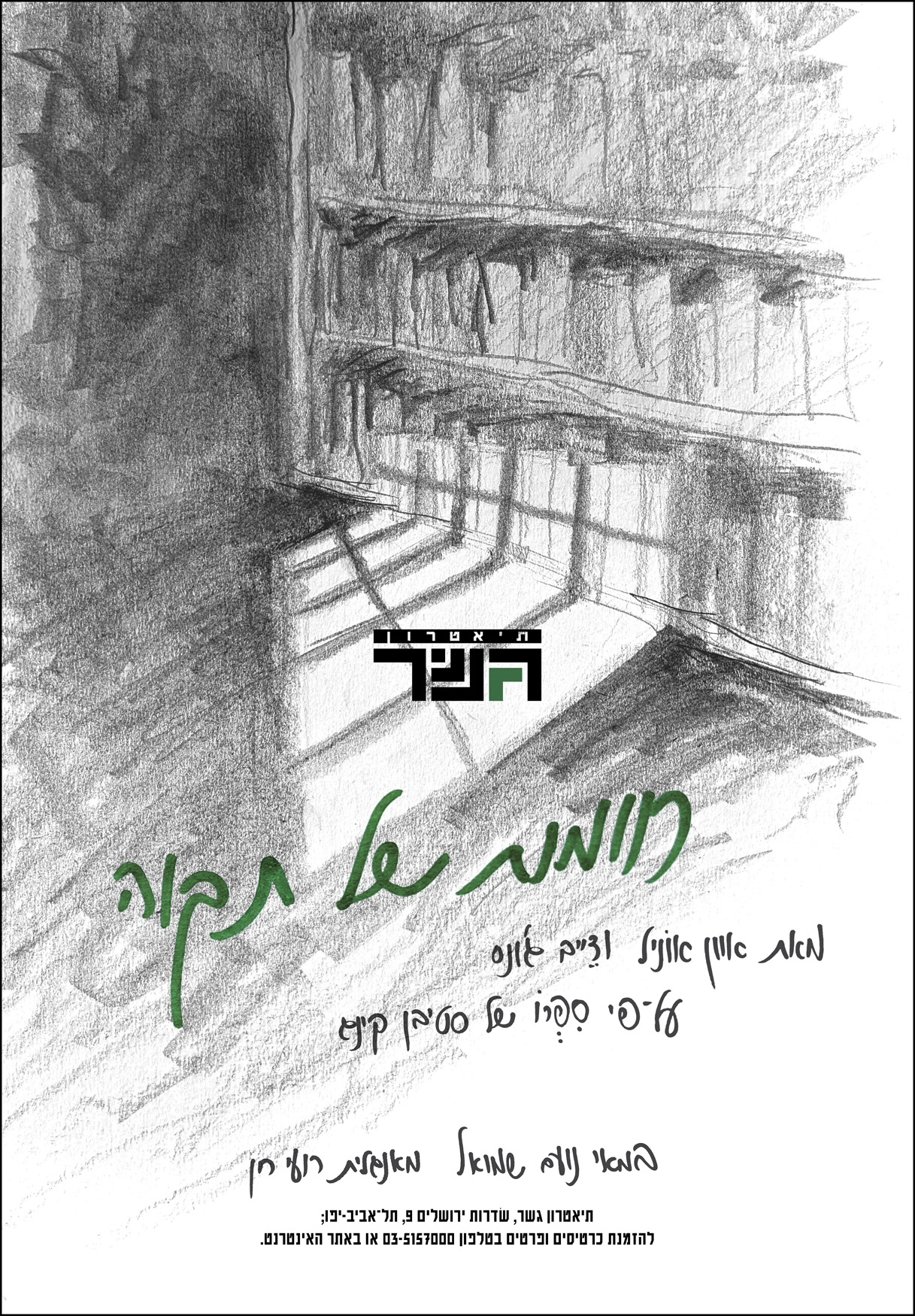
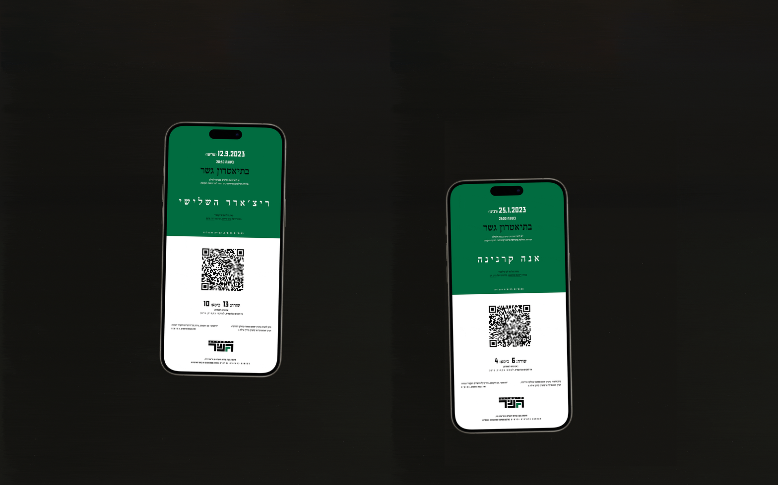
<h-300>Gesher Theatre<h-300> (bridge—in Hebrew) is probably the most <italic>avant-garde<italic> répertoire-theatre in Israel, and undoubtedly the most appreciated and sophisticated one; established 1991 in Jaffa by group of Russian immigrants who made “Aliyah”. Because of the following, this fresh-new visual identity is celebrating the theatre’s 30th anniversary by making homage and being inspired by the first theatre’s naive advertising posters.

<new>NEW<new><h-300-italic>Te'atronNeto<h-300-italic> in its 2024-33rd edition is <italic>the<italic> most known and appreciated festival and competition for <italic>original monodramas<italic>, which takes place in the shadow of an intense fighting. This festival identity developed to <italic>speak for<italic> the mood of the time.

<h-300-italic>Zvi Tolkovsky: Pilgrimage in the Holy Land<h-300-italic> exhibition took place at the Israel Museum, Jerusalem, between Winter to end of Summer 2023 (curated by Ronit Sorek with the assistance of Loti Gombosh). The visual identity for the exhibition was made taking into account Tolkovsky body of work which uses endless colour palette and have a Grotesk feeling in it.

<h-300>From the Memory<h-300> is three ascetic booklet formats combines inside Nathan Alterman [probably the greatest of all Israeli mid-20th-century poets] text creation in different subjects alongside researches about his literature work. The formats aimed to place a spotlight on the ongoing relevance of Alterman creative to our current days.

<h-300>HA'TARBUT<h-300> is an entire new [but nostalgic] identity for Tel-Avivian <italic>Heichal Ha'Tarbut<italic>, built in the late-Fifties, near the Israel National Theatre—<italic>Ha'Bima<italic>. As one of the most influential cultural institutions in the country since its foundation, the building holds musical and preforming-arts live performances between classical music to pop music concerts, and it is the official home for the Israel Philharmonic Orchestra. The identity’s concept based on the the knowledge that the performances themselves will bring the colour into the design, so the graphic decisions built just by texts and grids.

<h-300-italic>‘Year Zero’<h-300-italic> is an original-theatrical view on the <italic>1929 Palestine riots<italic> that were agitated the Mandatory Palestine (Land of Israel) contrary to the events of May 2021, which are still reverberating. This project is a graphic package for this current play, running at Jaffa Theatre—the Hebrew-Arab Theatre.

<new>NEW<new><h-300-italic>Haziza Seasonal Agriculture<h-300-italic> established during the end of the Seventies in the Israeli Northern Golan Heights (at the Moshav of Sha'al), by Haziza family, who specialized growing fruits with an emphasis on selling it suitability to each fruit’s growing season and with a singular focus on the variety of the fruit, its characteristics and uniqueness. The need for a new brand identity came from the increasing process of selling quality produce directly to the consumer, without large intermediaries and oiled systems that stand between the moment of picking and biting the fruit.

<h-300>Bracha Haifa<h-300> is a revival of a face written on the price list (or menu) inside the <italic>Bracha’s Sandwich Bar<italic> in Haifa city, Israel. As one of the known Haifa’s culinary scene, Bracha is leading the place since 1971 (from the very first day of <italic>its<italic> foundation), with just one week a year of vacation. This old <italic>but<italic> actively-kind lady makes the best sandwich you ever had!

<new>NEW<new><h-300>Tel Winery<h-300> made its first harvesting season during summer of 2019. Founded at the Moshav of Sha'al (Northern Golan Heights, Israel) as a varietal-wine single-vineyard winery—making wines with <italic>both<italic> “old world” and “new-world” techniques—by Lital Ovadia which is acting as the <italic>exclusive<italic> winemaker in addition of being the <italic>single<italic> grower of her own vineyards. Since its establishment and first bottling, the winery is in constant growth and much appreciated throughout the Israeli wine field.

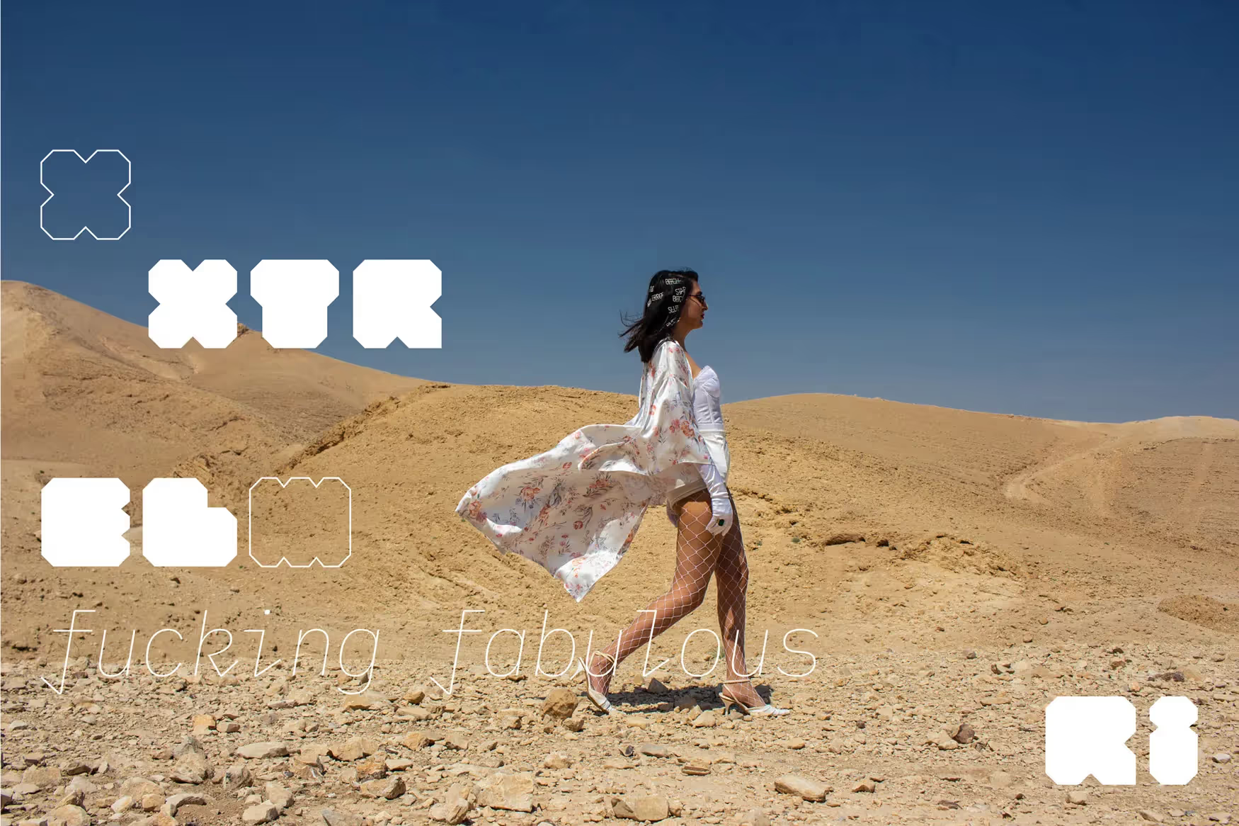
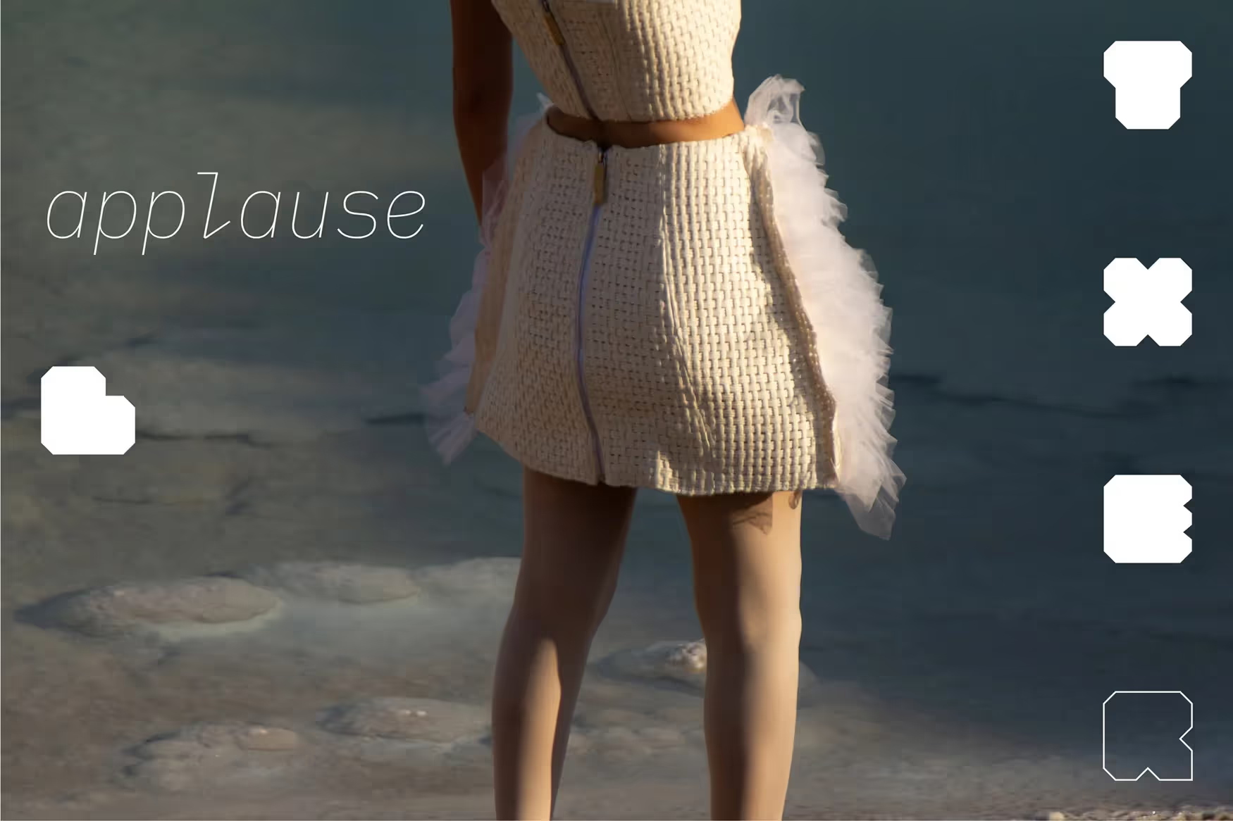
<h-300-italic>XTREMELii<h-300-italic> is an avant-garde fashion and accessories brand who is acting under the banner of uniqueness, craziness and a Japanese-punky style. Both the shrinking–expanding logotype and the human assemblage made to create a distinctive visual language which will wrap it all together into a coherent path.

<h-300>Haim Budapest<h-300> is a two-styles geometric typeface that published as a revival of a thirties Hebrew classics. The regular-heavy style designed by Jan LeWitt in pre-<italic>WWII<italic> Poland. The expanded style, however, is a studio extending to the original-weight digitalization, based on metal roundabouts signage located throughout Haifa streets.

This website type-set in ‘Eleventh’ typeface, which is another revival by the studio for a printed version of a classics. This face appears in the Hebrew Alphabets by Reuben Leaf book, self-published in New-York City, 1950.

Apologies, no results.